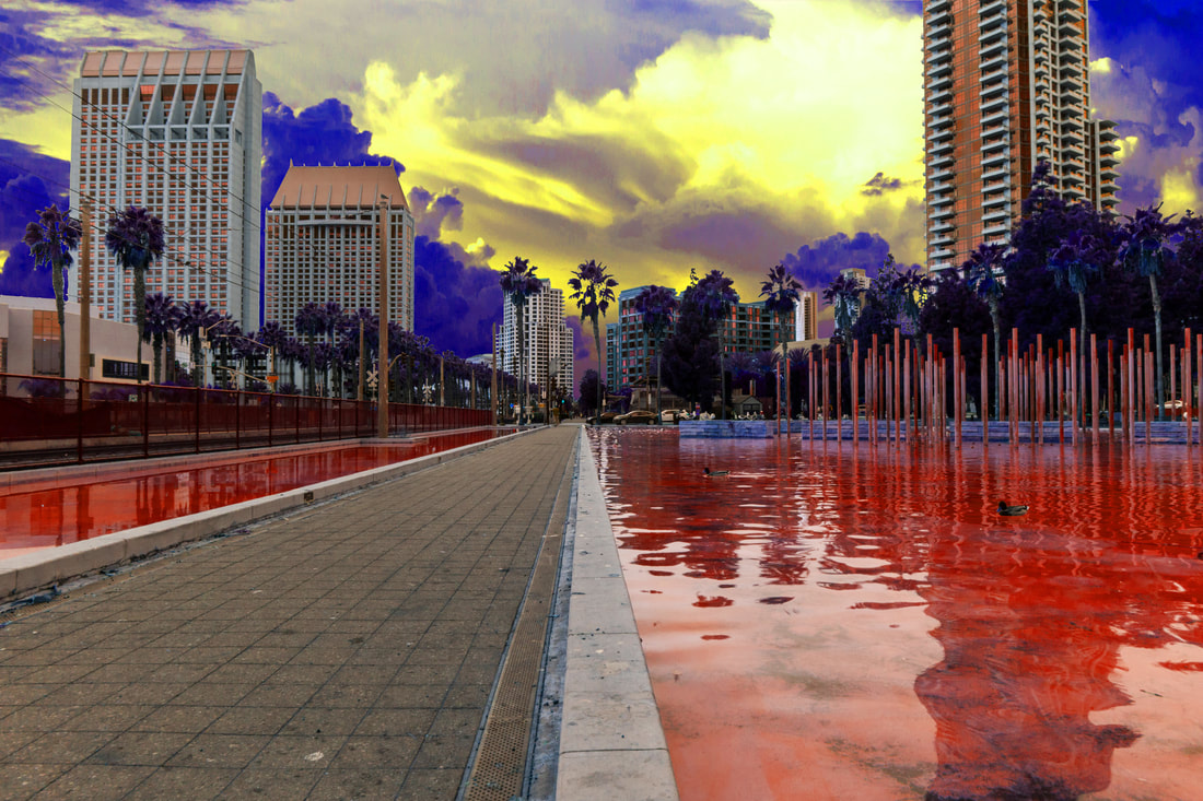
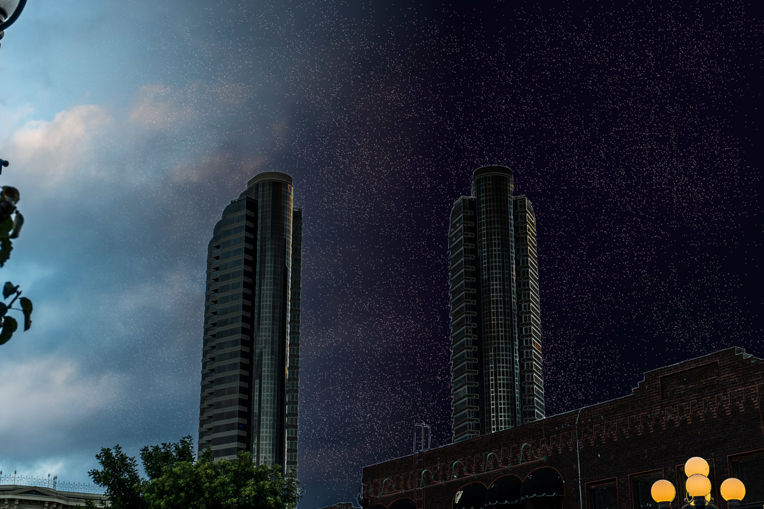
 This is an edit that I created from a photo that I took in Downtown San Diego(link). I edited this photo and added the copyright-free image of clouds using Photoshop. One way that this artwork could be improved upon is by making the cropping around the trees better. Other that this, I am very proud of this artwork and have put a relatively large amount of work into it.
0 Comments
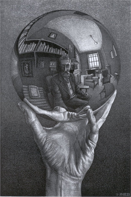 This is one of the more famous artworks created by the artist of the week, M.C. Escher. The lack of objects in the background contrasts with the mass of objects displayed on the subject. The focus of the artwork is made clear by how it is positioned in the middle of the canvas.
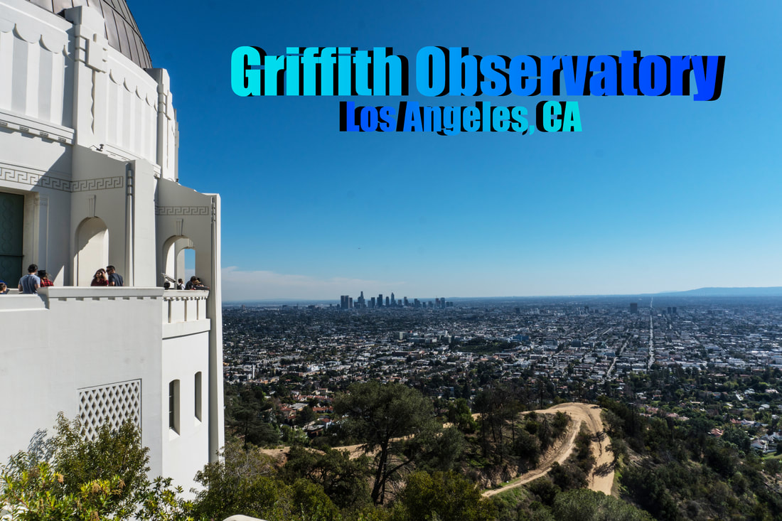 This is a graphic design image that I made in Photoshop about the Griffith Observatory in Los Angeles. I intentionally made the text seem as though it is facing a different direction from the other in order to make it less boring. One way that this image could be improved upon is by taking up more of the empty space in between the horizon and the top of the image. For now, this text is all that I wanted to put on the image.
 This is a photo that I took of a skyscraper visible from a hallway while in LA. One of the issues with this image was that it was very underexposed. I did this because I my tripod was broken at the time of taking the photo, so I had to take it handheld. This means that I had to set it to a faster shutter speed, underexposing the image. This wouldn't usually be an issue, but if you look closely at the whiter parts of the image, there is a lot of grain/noise.
 This is a piece of art done by the artist of the week, Georgia O'Keeffe. As the audience can tell from this painting, O'Keeffe gets her inspiration from the old American Southwest. The obvious subject of the painting is the skull in the foreground, which contrasts with the cloudy landscape in the mid and foregrounds.
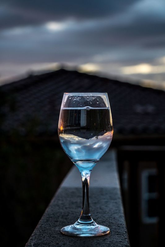 This is one of the photos that I took for the Sweetwater Authority competition. The reason why there is a lot of room at the top is because I felt that it was necessary to show the clouds, which shows the climate, and helps set the mood of the photo. The only thing that I would change about this photo is that I would clean the inside of the glass before taking the photo.
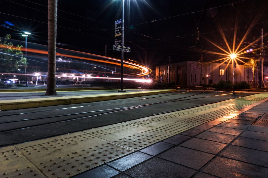 This is a photo that I took in downtown San Diego. One way that this photo could be improved upon is by lowering the aperture number so that the light 'stars' are not as strong. In order to compensate for this, I would have lowered the exposure time, which would have sacrificed some of the light trail from the tram.
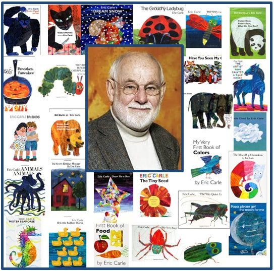 This is a collage of artworks made by the artist of the week, Eric Carle. Carle has a unique way of creating his work, called the collage technique. This was showcased in all of the art above as well as in his most famous work, a book titled The Very Hungry Caterpillar.
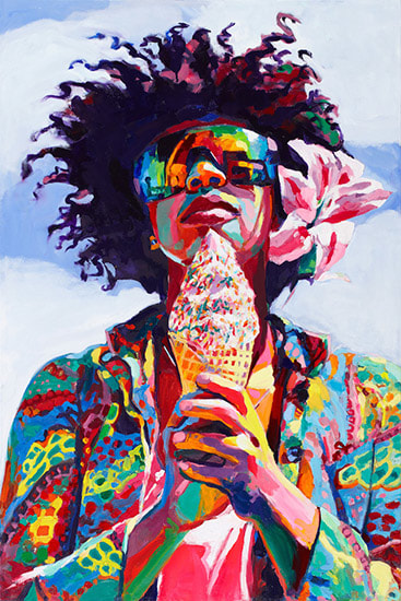 This is a work of art done by Sara Stieber, who was the artist of the week a couple of weeks ago. This image really highlights her style called "electric realism". This style consists of everyday events, but with explosive and surreal colors. Someone eating ice cream itself is not incredible or surreal, but electric realism makes them so.
 This is a piece of computer art made by me in Photoshop. I originally took the photograph in the day, but I flipped it into computer art by changing it to night. I then took that image, and blended it with the original to get this, an image I titled "Nightshift".
|
ArtistJacob Atiga is a Computer Art student at BVHS. Archives
May 2018
Categories |
 RSS Feed
