 This art is the winner of the Doodle4Google scholarship competition (2016-17). This is the artwork that won the competition because it displays a positive message of tolerance and getting along. The artwork itself has a nice combination of colors in the foreground, while having a crowd without color behind them. This creates contrast in the image.
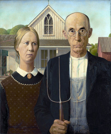 This is a painting titled "American Gothic", made by the artist of the week, Grant Wood. This image captures the zeitgeist of the time period with objects like the pitchfork in the foreground. More examples of this include the clothing and age of the people in the mid-ground , and the houses in the background.
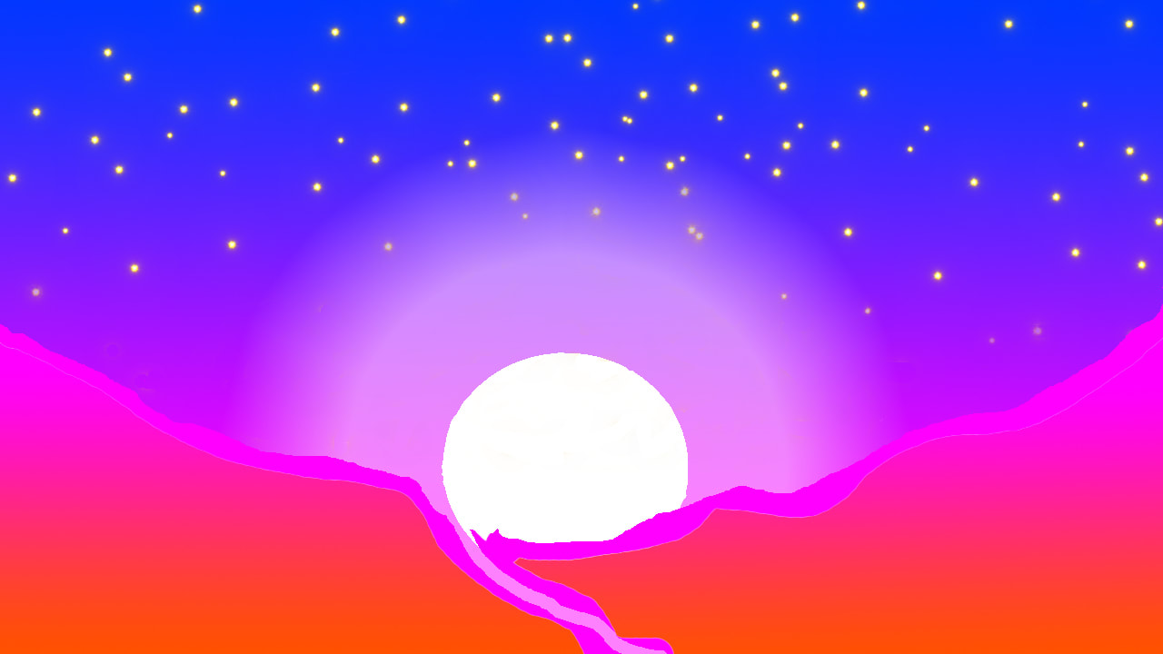 This is an image that I made using Photoshop. Most of the image is entirely original, with the exception of the stars. This image took about two full class periods. The most difficult part about this image was getting the colors just right so the image stands out. One way that this image could be improved upon is by making the stars more even in the sky.
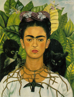 This is a piece of art done by the artist of the week, Frida Kahlo. This is an example of Kahlo's most popular type of art, self portraits. This specific art has very bland colors that blend well from the plants and dragonflies in the background to Frida Kahlo herself in the foreground.
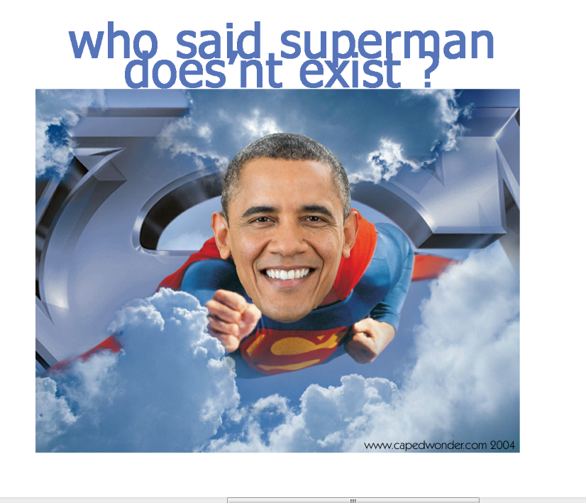 This is an old image taken from the editing tab on Mr. Lim's website. There are many things wrong with this image. There are many spelling and grammar errors, as well as the fact that the letters are overlapping themselves. However, the cropping of Obama's head is decent and the overall image is quite funny.
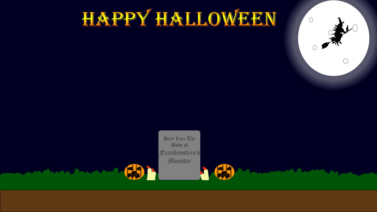 This is an image that I made in Photoshop for Halloween. One way this image could be improved upon is by adding more texture to where the grass meets the ground. Also, the grave is low on the ground, so it creates this wide open space. Maybe that empty space could be filled with stars or hills. I may make these changes to the image and re-upload it to my website.
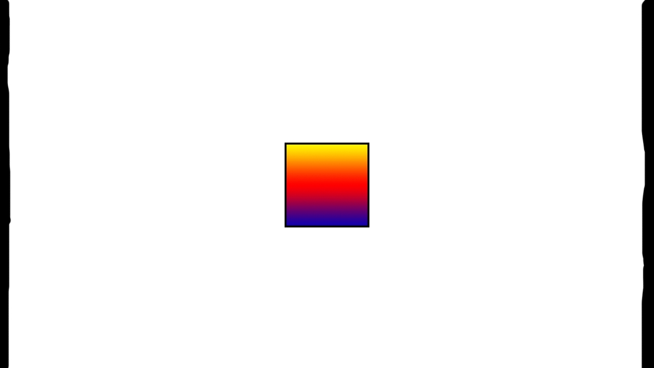 This is a gif that I made in Photoshop using multiple layers and the frame animation function. I tried to create a large contrast between the color in the box and the black that is closing in on it from the sides. One way that this image could be improved upon is by removing the yellow signifying the buildup of the color explosion on the frame afterwards.
|
ArtistJacob Atiga is a Computer Art student at BVHS. Archives
May 2018
Categories |
 RSS Feed
