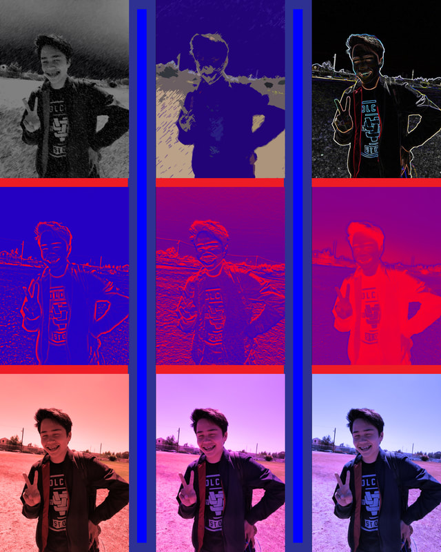
 This is an image that I have made as my 9 picture collage. One way that this image could be improved upon is by changing the the filters to fit one theme. If they all fit the same theme, the image would be more pleasing to look at as well as less diverse.
0 Comments
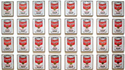 This is a piece of art done by the artist of the week, Andy Warhol. The image is basically 32 Campbell's Soup cans that use connected lines as shapes to form structure for the image. This painting changed the way people observed art at the time. This shows how influential Andy Warhol's art was to society.
 This is a GIF that I have made with a transparent background so that (If I wanted) I would be able to export this into a program as an idle animation. One of the areas where this GIF could improve is the removal of the blurred background that still remains on the arms. This change will be made and re-posted to my assignment page.
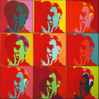 This is a self portrait of Andy Warhol, who also happened to edit it himself. This is an example of the type of artwork that Warhol creates. Warhol's style of art is called "pop art", which is art that is based on current events as well as celebrities.
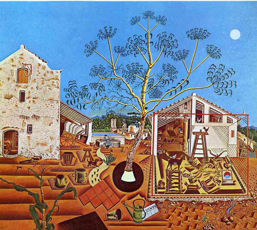 This is another painting by the artist of the week, Joan Miro. Miro used lines as the structure for most of the objects in this painting. For example, the soil in the structure in the midground on the right side was made using lines that are connected to complete the shape. Overall, this is a wonderful painting that deserves its recognition.
 This is the art I have made as a representation of the phases of a solar eclipse. There are many ways that I could improve this image, such as making an odd number of circles instead of the current 6 in order to have a circle in the middle that represents totality. Another way that this image could be improved upon is by lining up the circles a bit neater.
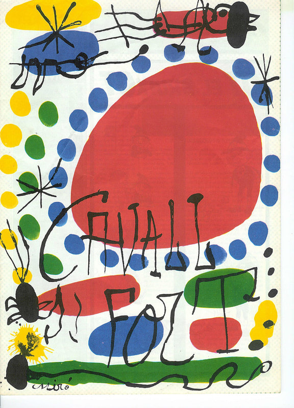 This is a piece of abstract art is done by the artist of the week, Juan Miro. In this piece, there are not too many colors to were the image is blinding, but is instead just the right amount to were these simple colors, along with the shapes, are pleasing to look at.
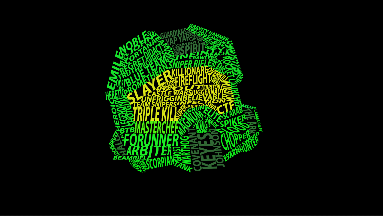 This is a word cloud image done by Wilfred Vergara. The color difference really puts emphasis on the words in the foreground as opposed to the black background. Overall, there is not much that can be done to improve this image, as it is a great word cloud that pays homage to the Halo franchise.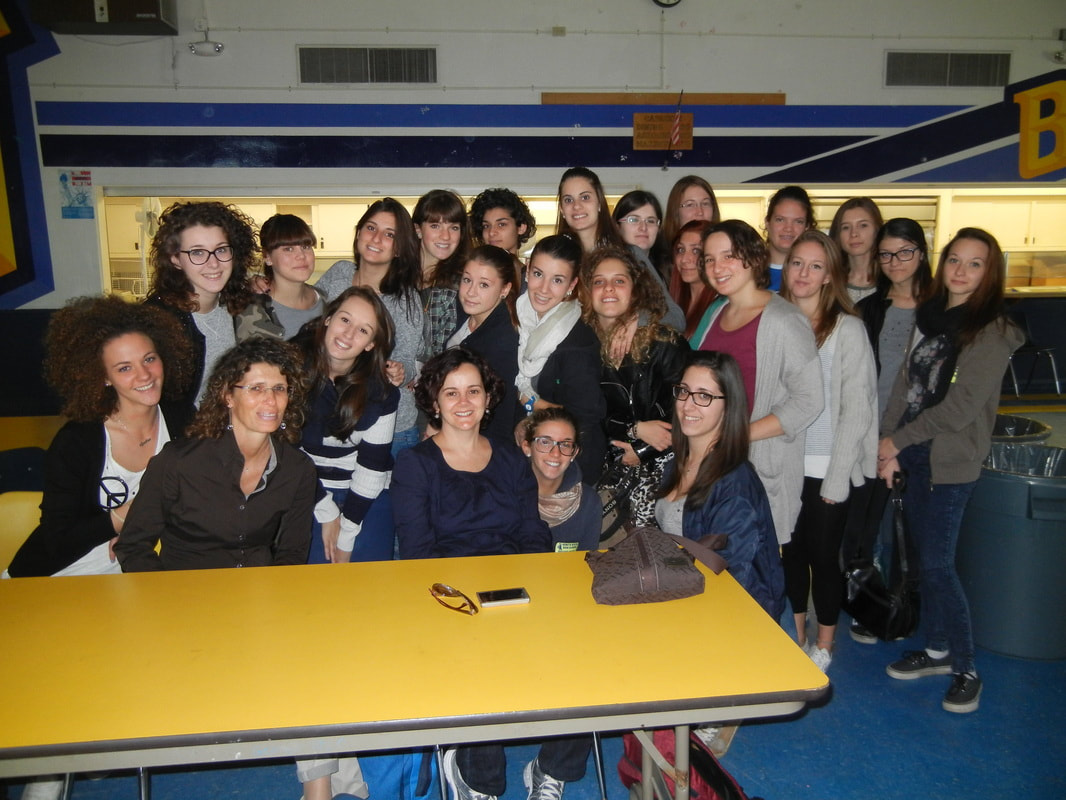 This is a photograph taken from the editing page on Mr. Lim's website. This would be a great picture, however, the trash can in the background as well as the table in the foreground makes it seem like the focus is not on the people. This photo could be improved by changing the location.
|
ArtistJacob Atiga is a Computer Art student at BVHS. Archives
May 2018
Categories |
 RSS Feed
