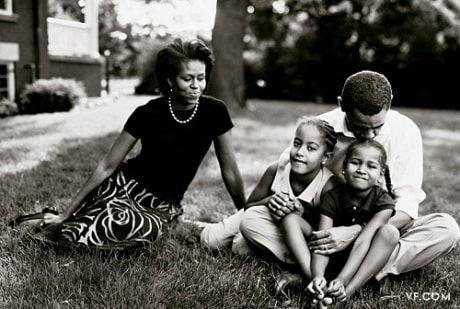
 This is a photo taken by the artist of the week, Annie Leibowitz. This is a good photo mainly because it captures the emotion of the family well, and provides more human traits to these large political figures. Another component of this photo that makes it stand out is the composition. There is just enough room on each side of the subjects to keep focus.
0 Comments
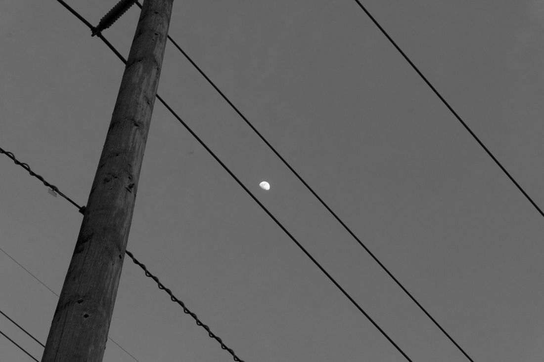 This is a photo that I recently took while in Chula Vista. One way that this photo could have been taken better is by lowering the shutter speed to get a more clear image. Before I converted it into black and white, the grain was very noticeable because it was not properly exposed. Luckily, the black and white makes it look a lot better in terms of exposure.
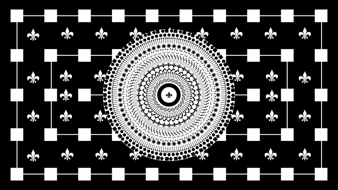 This is a piece of art that I created using the basic tools and shapes within Photoshop. The main focus of the artwork is composition, with most of the positioning having pinpoint accuracy. One way that this artwork could be improved upon is by adding a little bit of color. I experimented with this already but could not get it right. If I find a way to incorporate color, I will make the changes and post the new photo to the assignments page.
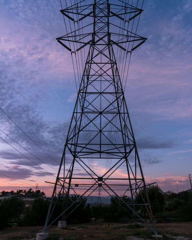 This is a photo that I took recently near my house in Chula Vista. One area that this photo could be improved upon is composition. The radio tower is cut off in this photo near the top. I believe that this photo would be a lot better if the whole tower was shown.
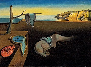 This is a piece of art made by the artist of the week, Salvador Dali. The theme of the art is surrealism. This can be inferred by the fact that the subjects in the painting are very dreamlike, and the fact that the clocks seem as though they are melting, which wouldn't happen in real life.
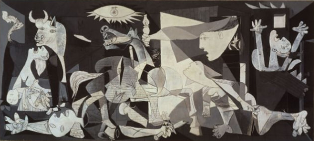 This is a work of art done by the artist of the week, Pablo Picasso. This painting highlights one of Picasso's best styles; cubism. Picasso used shapes, one of the most fundamental parts of art, along with composition to create this masterpiece. Picasso transitioned to this type of art after painting in the same style as everyone else at the time.
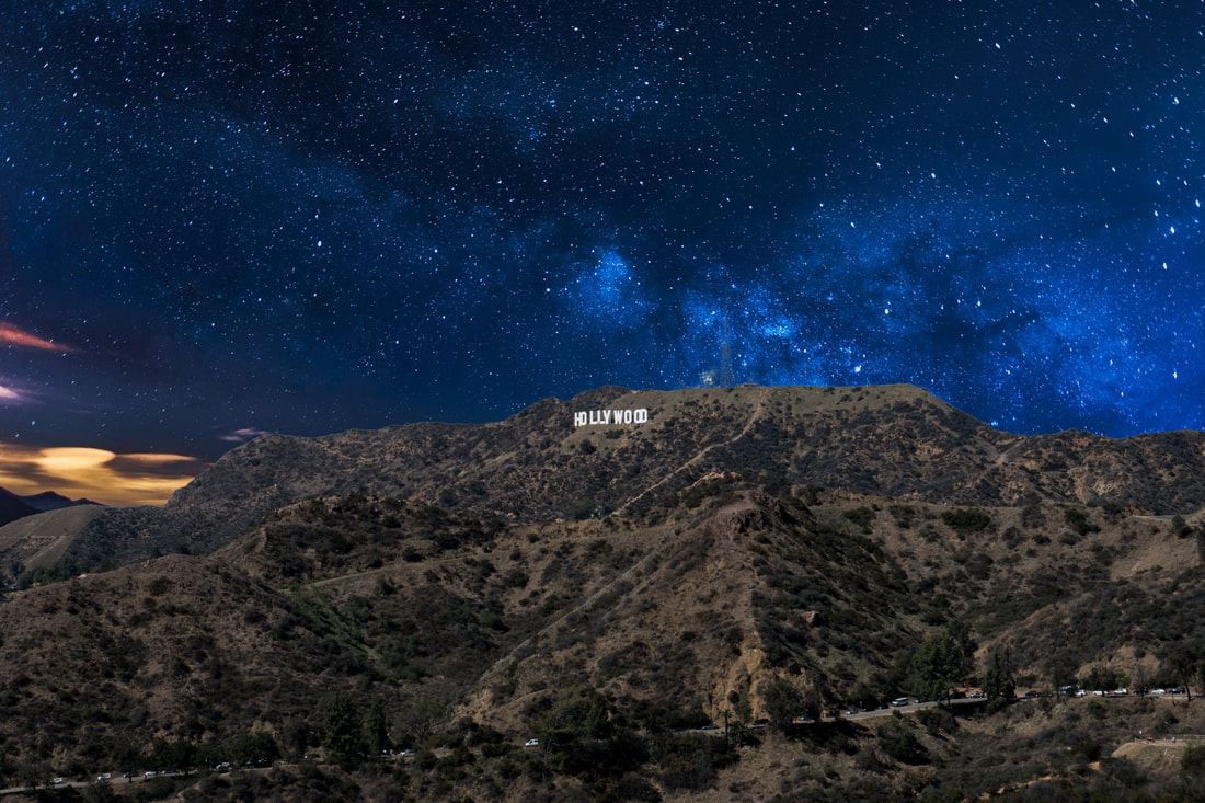 This is an edit that I created in Photoshop earlier in the week. The idea was to change the old background, a boring completely blue sky, into a night sky that is explosive in color. For the most part, I succeeded. However, the foreground now looks a little more exposed than should be with this background.
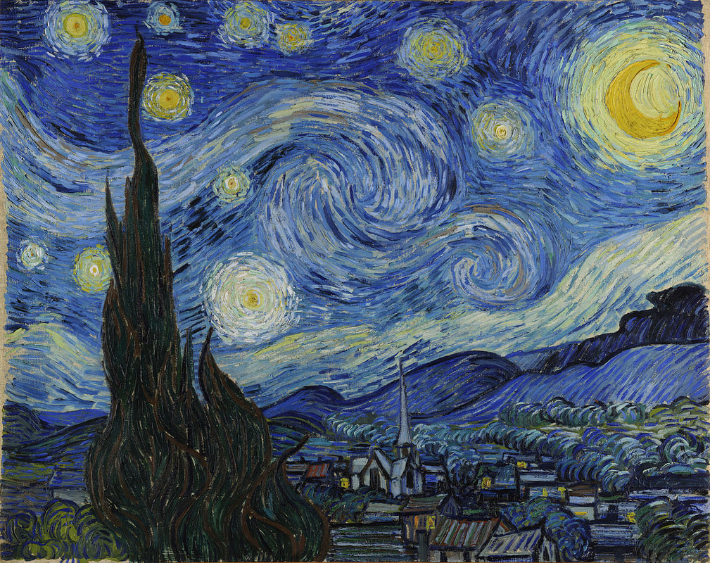 This is one of the most famous paintings done by the artist of the week, Vincent van Gogh. What makes this painting so great is the intense colors, and the fact that the purpose of the painting is left up to the viewer's interpretation. Also, the tall dark objects in the foreground add a surreal aspect to the painting.
|
ArtistJacob Atiga is a Computer Art student at BVHS. Archives
May 2018
Categories |
 RSS Feed
