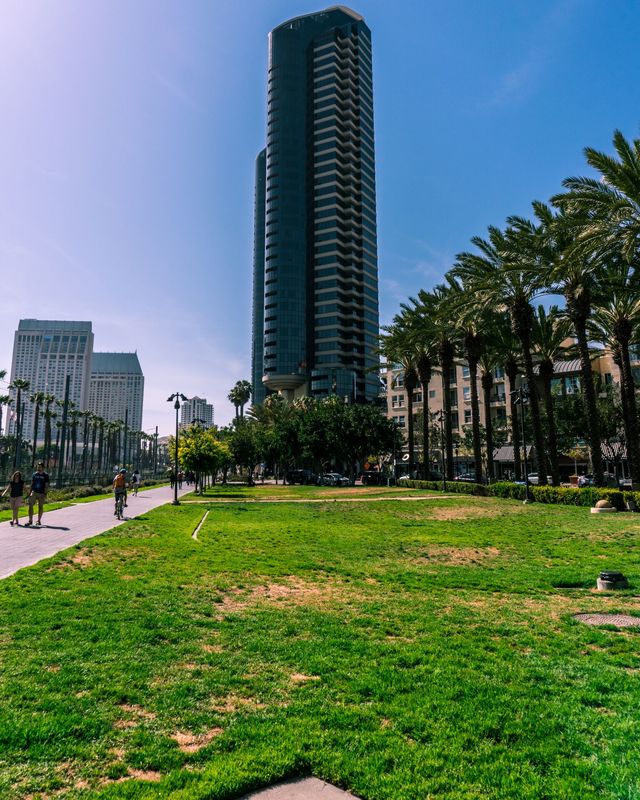
 This is a photo that I took in Downtown San Diego. The main focus when taking the photo was composition. This is shown by the fact that the lines of trees and the sidewalk act as leading lines to draw attention to the subject. One way that this photo could be improved upon is by tuning the split toning of the colors.
0 Comments
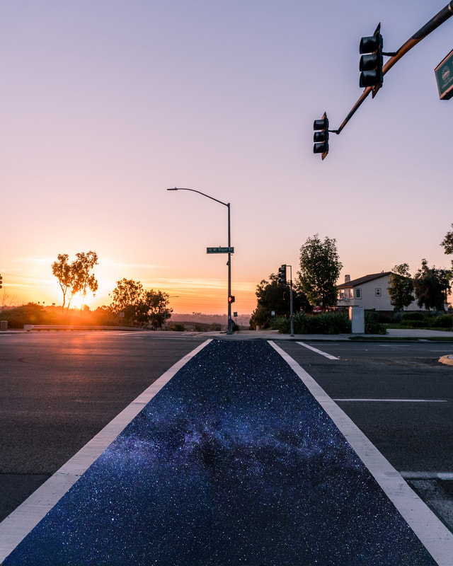 This is an edit that I made in Photoshop using a photo that I took earlier this year and combining it with a copyright free image of the stars that I found online. When I took this image, I was wishing I was in a more interesting place while walking home. I used the crosswalk to represent this, which could be improved upon by adding other images to the sides or above it.
1. Ansel Adams
2. Peter Max 3. Sarah Steiber 4. M. C. Escher 5. Banksy 6. Shepard Fairey 7. Salvador Dali 8. Norman Rockwell 9. Keith Haring 10. Frida Kahlo 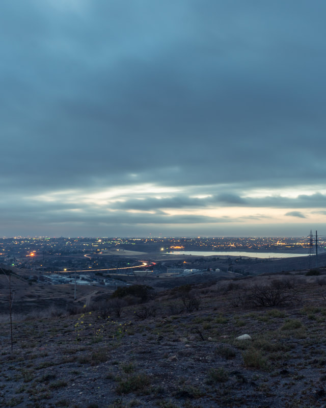 This is a photo that I took near my house last weekend. One way that this image could be improved upon is by using better lighting for the foreground. This could be achieved by using an even slower shutter speed, or decreasing the aperture before taking the image. I tried to recreate this in post production, but it would look better if these corrections were made in-camera.
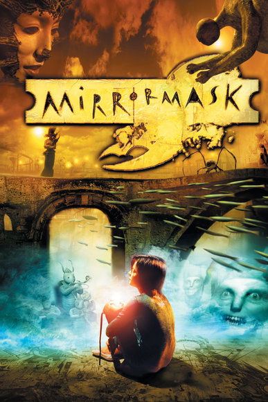 This cover is an artwork created by the artist of the week, Dave Mckean. In this artwork, Mckean uses opacity to blend the images together. This is an example of mixed media because there is a photo of a child blended into surreal artworks.
 This is a photo of a shipyard that I took while going downtown. One way that this image could be improved upon is by exposing it for longer, so that the water in the mid-ground would be more smooth. This would create a juxtaposition of texture between the rough shipyard and the smooth water.
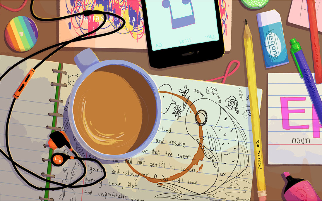  I voted for this artwork, and believe it will win. This is because I am certain that this scenario is something that many users of Google can identify with, specifically students. In terms of art components, the composition is incredible, with everything cleverly placed to spell out the word "Google".
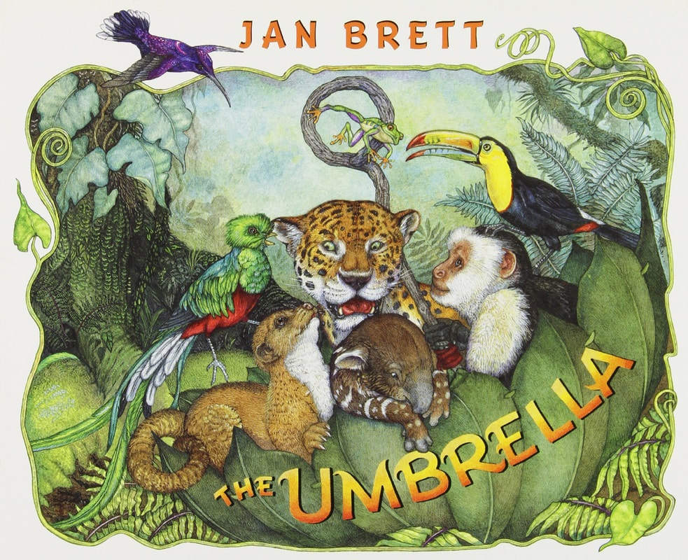 This is the cover art of a children's book made by the artist of the week, Jan Brett. Just like "The Umbrella", most of Brett's books are of animals that are given human traits in order to create a more heartfelt story. The art within the books is generally focused on color, and seems to be all hand drawn.
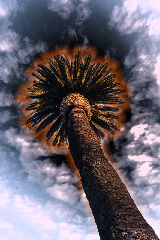 This is an edit of a photo that I took recently while going out for dinner in San Diego. One way that this image could be improved upon is the cropping. If the cropping on the tree was better, the glow effect would fit into the image more. I attempted to fix this issue using the "Select and Mask" option in Photoshop, but the results were the same.
|
ArtistJacob Atiga is a Computer Art student at BVHS. Archives
May 2018
Categories |
 RSS Feed
