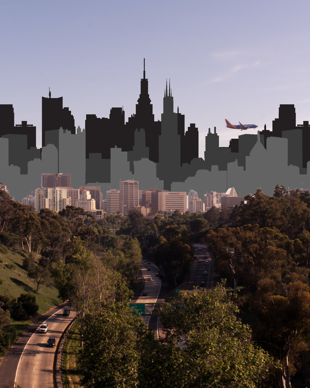
 This is a photo edit that I made in Photoshop. I am not too proud of how it turned out, which is alright because I just wanted an artwork that I could put together within the class period. One way that this edit could be improved upon is by using higher resolution images for the skyline clipart. Then, I could export this file with high quality. Luckily, they are all a certain color, which helps with the pixelation.
0 Comments
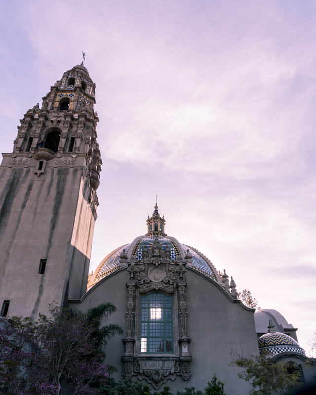 This is a photo that I took in Balboa Park while on our way to Downtown San Diego. Overall, I am pretty proud of this photo. However, one way that it could be improved upon is by removing the odd blur in the bottom right corner of the photo. Other than this, I believe that the composition, lighting, and focus are good for what mood I wanted to accomplish.
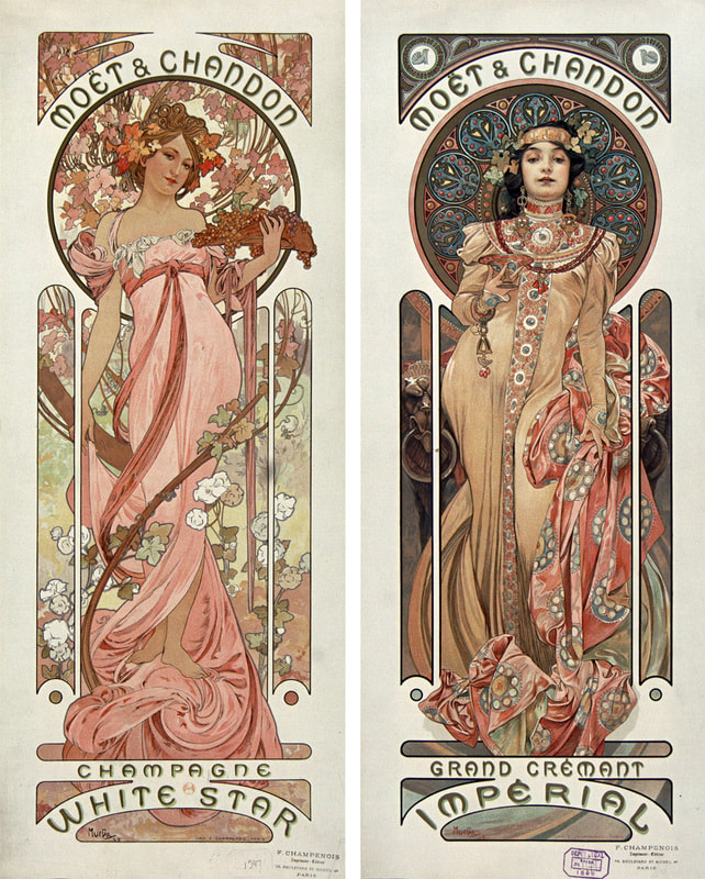 These are artworks by the artist of the week, Alfonse Mucha. They are a great example of weaving text into the image in graphic design. This style of decorative art is called Art Nouveau. Mucha is most known for this style in all of his artworks, whether it be aesthetics or art on objects.
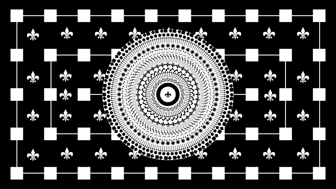
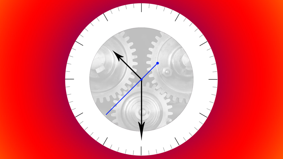 This is a piece of computer art that I made in Photoshop. Overall, I am proud of the fact that I was able to get the composition for this image correct, with almost every aspect being perfectly lined up or centered. This is because I created it with the main focus of composition in mind. I titled the image "Counting Time".
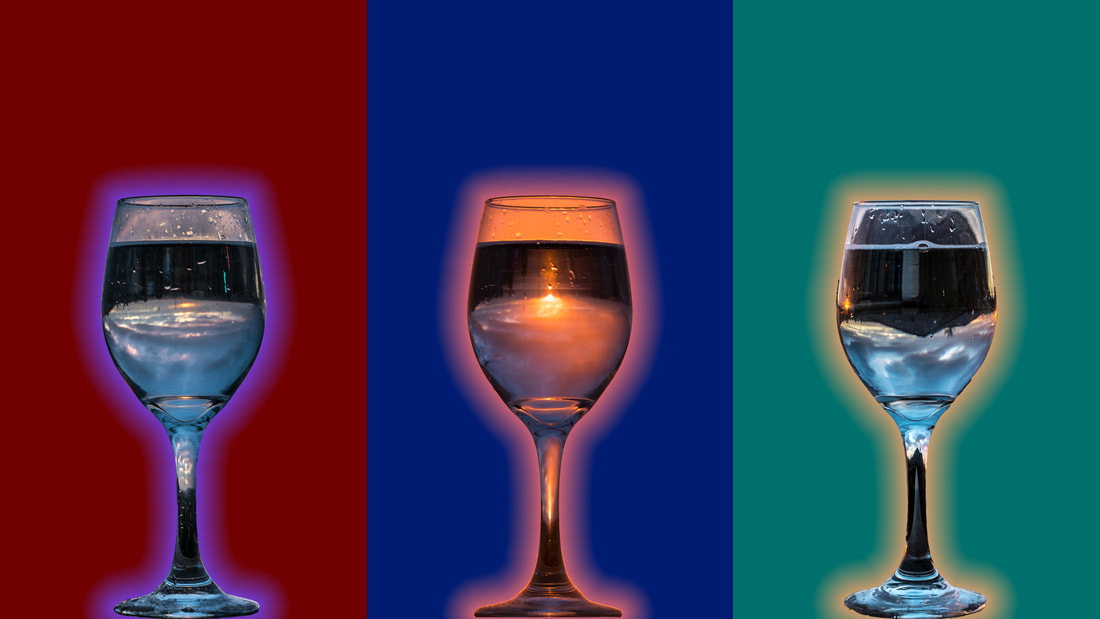 This is a piece of computer art that I made in Photoshop, made from a few images that I took for the Sweetwater Authority photography competition. One thing that I would like to change about this artwork is composition; the block-like nature of the colors.
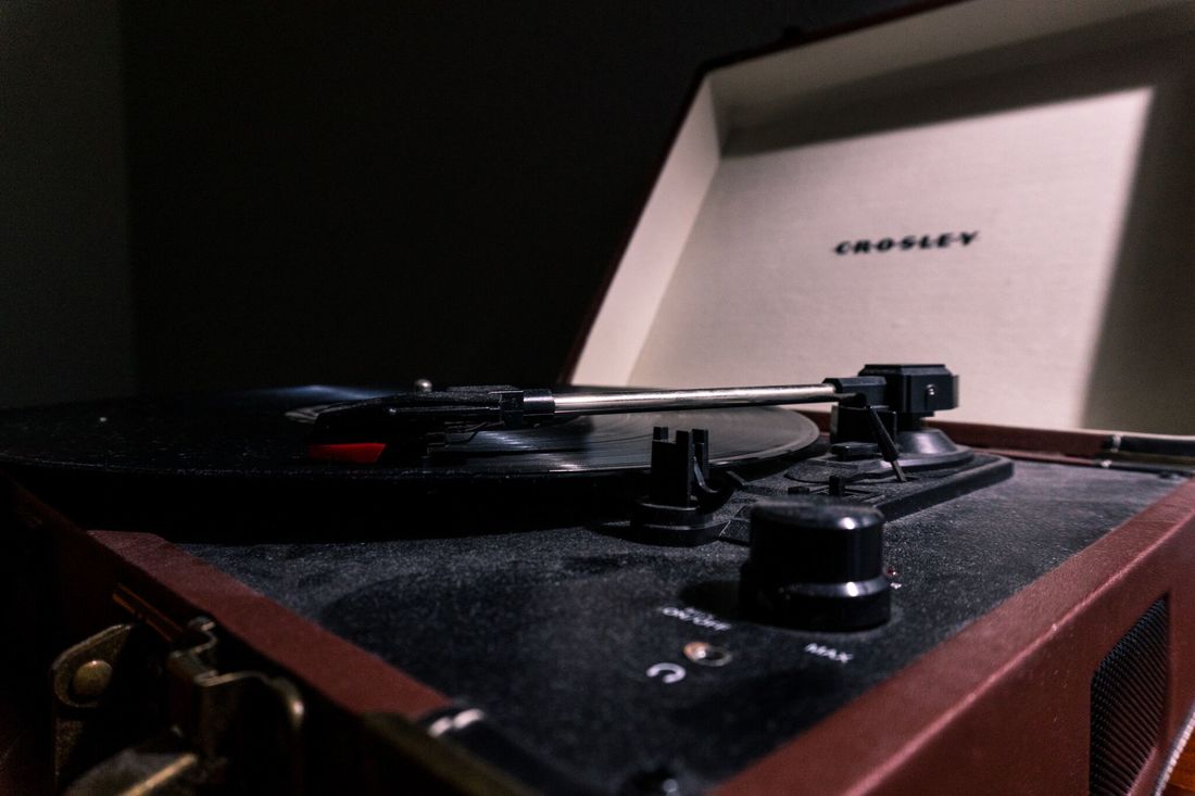 This is one of the many photos that I took for the MOPA competition. One way that this photo could be improved upon is by removing the dust from the record player before taking the photo. I thought that this would add an old theme to the photo, but it only ended up looking like not a lot of time was put into it.
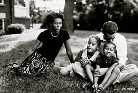 This is a photo taken by the artist of the week, Annie Leibowitz. This is a good photo mainly because it captures the emotion of the family well, and provides more human traits to these large political figures. Another component of this photo that makes it stand out is the composition. There is just enough room on each side of the subjects to keep focus.
 This is a photo that I recently took while in Chula Vista. One way that this photo could have been taken better is by lowering the shutter speed to get a more clear image. Before I converted it into black and white, the grain was very noticeable because it was not properly exposed. Luckily, the black and white makes it look a lot better in terms of exposure.
 This is a piece of art that I created using the basic tools and shapes within Photoshop. The main focus of the artwork is composition, with most of the positioning having pinpoint accuracy. One way that this artwork could be improved upon is by adding a little bit of color. I experimented with this already but could not get it right. If I find a way to incorporate color, I will make the changes and post the new photo to the assignments page.
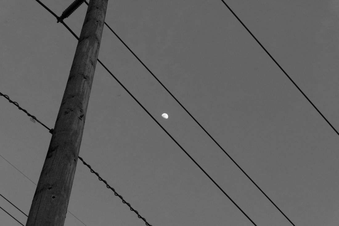
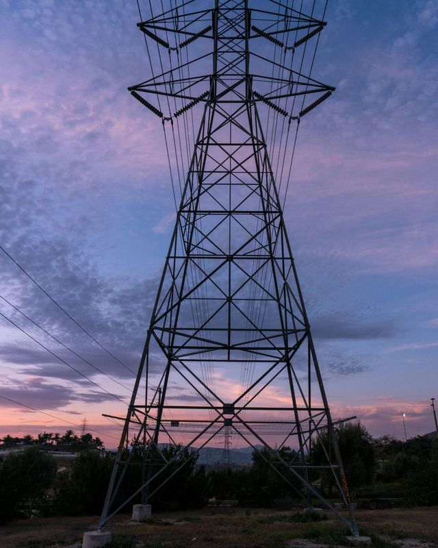 This is a photo that I took recently near my house in Chula Vista. One area that this photo could be improved upon is composition. The radio tower is cut off in this photo near the top. I believe that this photo would be a lot better if the whole tower was shown.
|
ArtistJacob Atiga is a Computer Art student at BVHS. Archives
May 2018
Categories |
 RSS Feed
