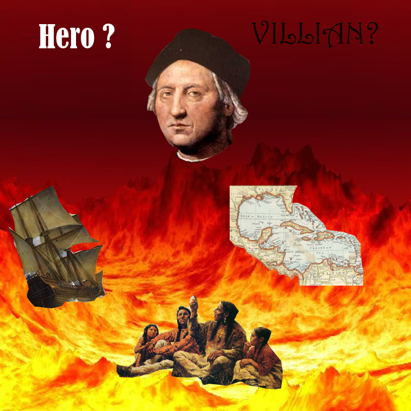
 This is an image taken from the editing page on Mr. Lim's website. This image had a great idea. However, the cropping on some of the embedded images is poor and there is a spelling error in the word villain. If these changes were to be made, this would be a great image.
0 Comments
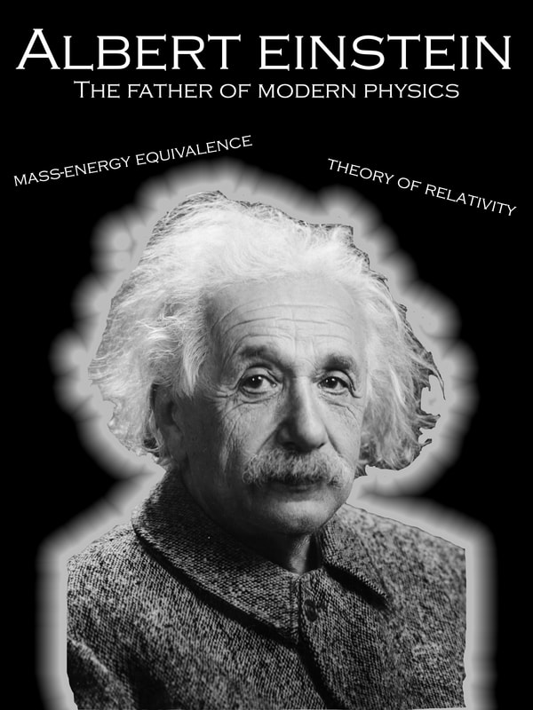 This is an edit that I have made highlighting the father of modern physics, Albert Einstein. The goal of this assignment was to show off the glow feature in Photoshop as well as create a edit that shows off the works of Einstein. One way that this image could be improved upon is by making the cropping tighter around his hair.
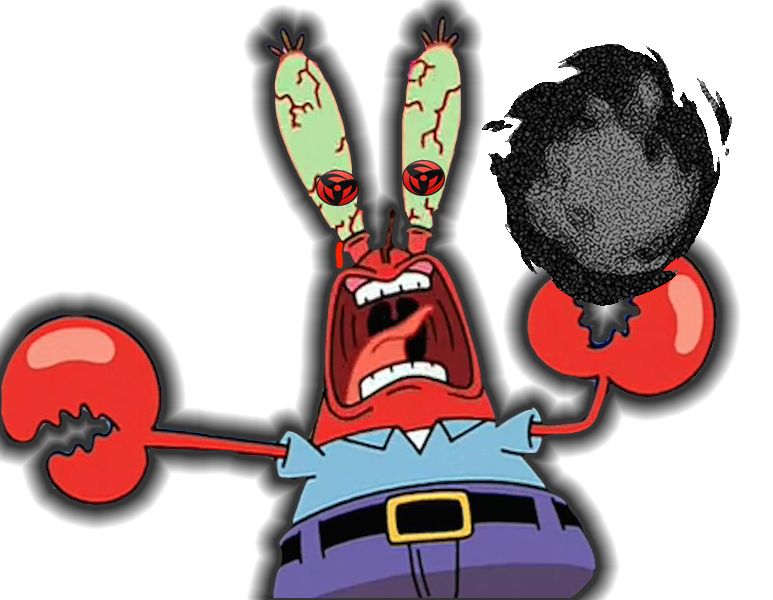 This is a photo edit that I made in Photoshop. The goal of this image was to use the glow feature in Photoshop while also creating a humorous edit of the character from Spongebob, Mr. Krabs. The glow around Mr. Krabs is black because it matches the color of the fireball.
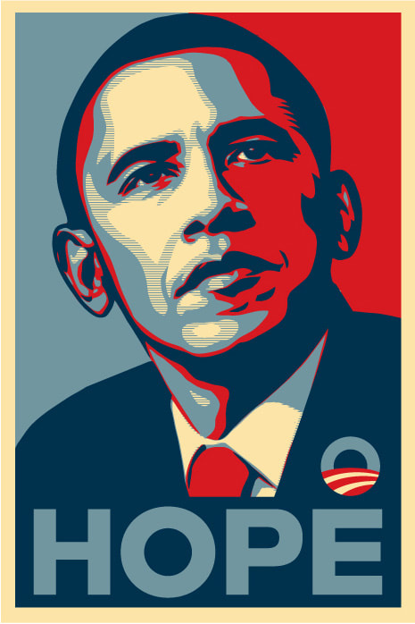 This is a piece of art done by the artist of the week, Shepard Fairey. This graphic design image became widely known after the presidential election in 2008. Fairey's use of color is kept simple, as he only uses different shades of the same 3 or 4 colors. However, this makes the image pleasing to look at, which is what most graphic designers seek to achieve.
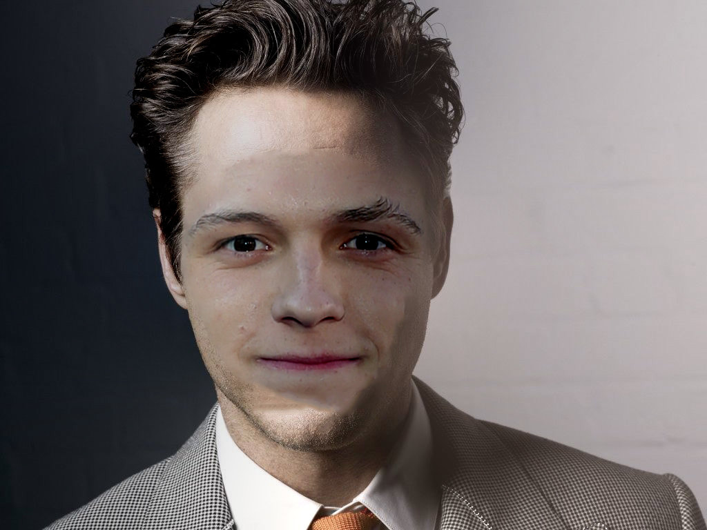 This was my attempt to merge the faces of Tom Holland and Robert Downey Jr.. There are many things that could have been done better with the blending of these two faces. However, the main issue was the difference in shade between the two images. If the two faces had the same setting, it would have turned out better.
Blog is canceled today due to fall 2017 project.
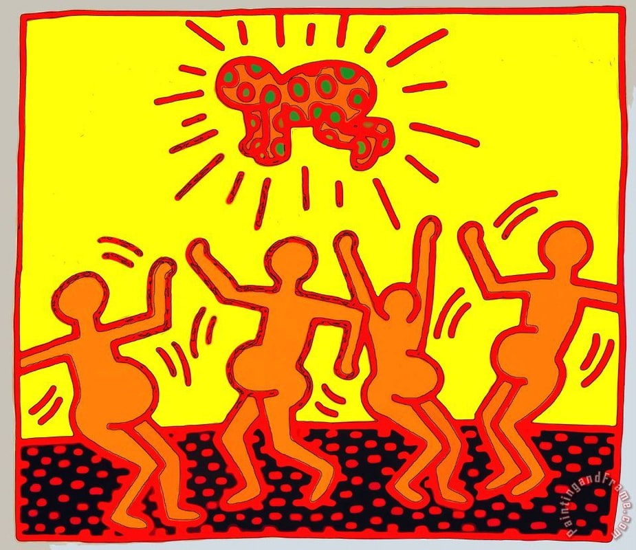 This is a work of art done by the artist of the week, Keith Haring. Haring's style is to have simple drawings and simple shapes tell a story. In this specific piece, there are four pregnant woman seemingly worshiping Haring's famously drawn baby. This image is a good example of Haring's style because all of the shapes are simple but tell a story.
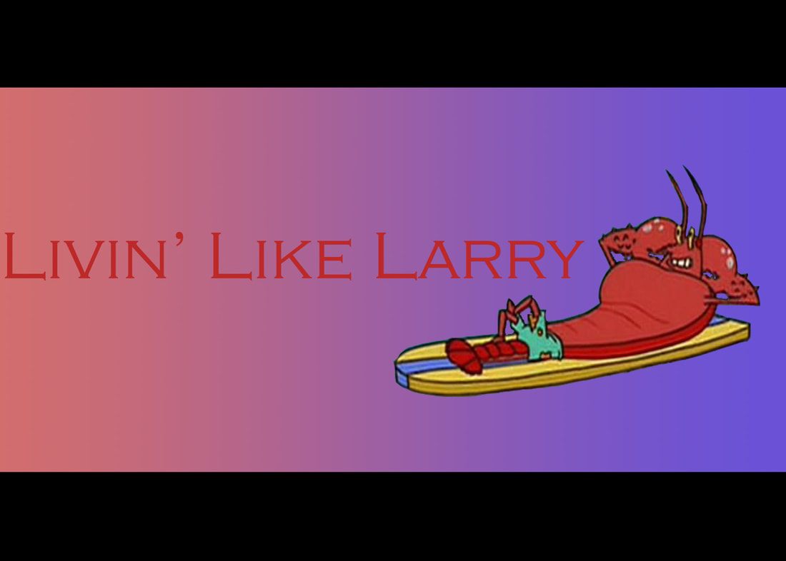 This is an edit that I have made that pays homage to Larry the Lobster. I am proud of how clean the cropping turned out from the original image to this background that I made in advance. One way that this image could be improved upon is by changing the color of the text so that it does not blend in with the background as much.
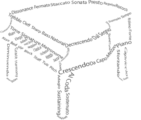 This is a word cloud done by Mikko Benaso. This is a good example of a word cloud because it reflects his interests as well as his artistic ability. In this word cloud, the words act as lines to connect the shapes that form the piano. Overall, this image completely fills the guidelines of the assignment.
|
ArtistJacob Atiga is a Computer Art student at BVHS. Archives
May 2018
Categories |
 RSS Feed
